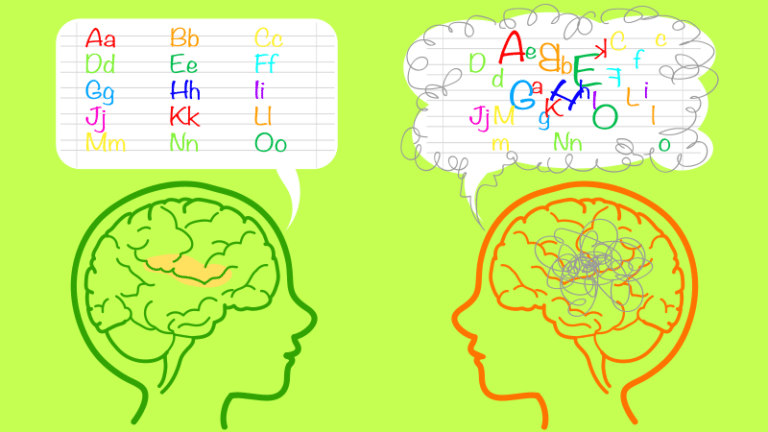
According to the International Dyslexia Association, as much as 15 to 20 percent of the U.S. population may have symptoms of dyslexia. Those include slow or inaccurate reading, weak spelling, and poor writing. While not all reading problems are caused by dyslexia, some of the same accommodations can help many struggling students. Using the best fonts for dyslexia is one way you can help.
How do these fonts work?
First, it’s important to understand that switching to a different font will not magically “cure” dyslexia, but they can be helpful. As long as you don’t neglect other proven strategies for helping those with dyslexia (and other learning disorders), these fonts are just one more tool in your toolkit.
According to research, the best fonts for dyslexia (and other learning disorders) share these characteristics:
Sans Serif

Image: Creative Spark
This term literally means “without serif.” Serifs are those little projections at the ends of letters some fonts use to make them look a little fancier. Times New Roman is a classic example of a serif font, while Arial is a common sans serif option.
Non-Italic, Non-Oblique
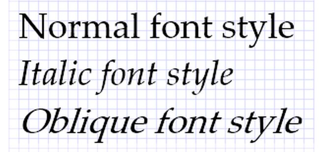
Image: Microsoft Docs
Oblique fonts are a slanted version of a font, while italic fonts have a slanted and more stylized appearance. Either way, this style significantly reduces readability, so stick to upright fonts, also known as roman style.
Monospace
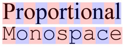
Image: Wikimedia Commons
In a monospace font, each letter (and space) takes up the same amount of horizontal space on a line. The opposite is proportional or variable-width fonts. Monospace fonts are harder to find these days, but there are some good options out there.
Specially designed fonts like Dyslexie and OpenDyslexic add one more feature. They strive to make the differences in mirrored letters like “d” and “b” more obvious, with subtle changes to their appearance. Some researchers feel that special fonts like Dyslexie don’t offer any true benefits at all. But they also say there’s no harm in trying them out.
Best Standard Fonts for Dyslexia
With those criteria in mind, these four standard picks are typically recommended as the best fonts for dyslexia. They’re available on pretty much every computer, so consider setting one of them as your default.

This sans serif, non-italic font isn’t monospaced, but Arial is still a good choice as long as you don’t italicize it.

If you’re looking for a serif font, try Courier. It’s monospaced, which makes it easier to read than its cousin Times New Roman.

Here’s another sans serif font to try. Note that like Arial, it’s not monospaced, but it is still clear and easy to read.

Another font that’s not monospaced but is sans serif, Verdana is overall rated as fairly easy to read.
Specially Designed Fonts for Dyslexia
There are a few fonts on the market that may or may not make a real difference for those with dyslexia. While the research is still out, it doesn’t hurt to give them a try.

In Dyslexie, letters have heavier bottoms, slightly adjusted shapes, and longer sticks. This is a licensed font, and you’ll need to pay to use it in all your programs. Learn more about Dyslexie here.

OpenDyslexic is a free font and uses heavier bottoms and irregular shapes just like Dyslexie. Find out more about OpenDyslexic here.
Other Good Fonts for Dyslexia
Try not to shudder, but Comic Sans is often recommended for folks with dyslexia. The irregular design of the letters makes it easier to read. (Only “b” and “d” are true mirrors.)
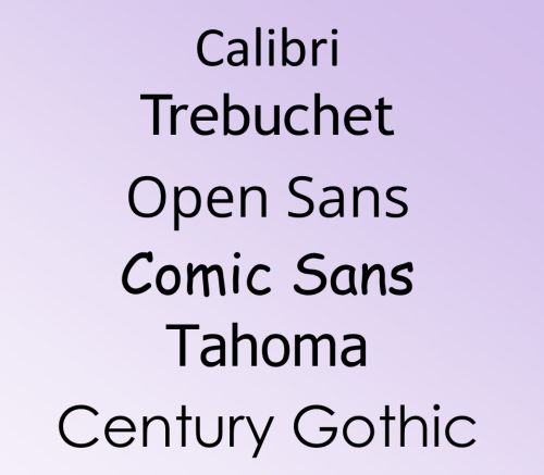
You can also try Century Gothic, Trebuchet, Calibri, Open Sans, and Tahoma, among others. In general, just remember to choose simple fonts without serifs that provide good spacing between letters. Avoid fonts that are “condensed,” and don’t use italicized versions.